Personal Branding
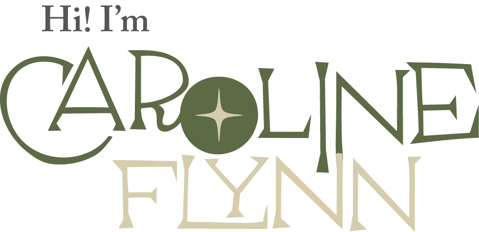
My Interpretation
I chose to remake my own personal logo because i wasn't drawn to what I had created before. I needed to rethink what I wanted to show to the world, so I found a font that I really liked, and I really love vintage designs, so I found a star that was very 1950s. I wanted it to look professional but also have some personality and little elements here and there that feel more like me.
Color Palette
I found a main green color that I really liked, then I added a light beige that complemented it and a dark brown that I could use as an accent. I also found 2 blue colors that went with the rest that I could use whenever I needed them.
Logo

For my logo itself, I used the F from my last name because I really liked how the star I used in my logotype fit so well into the stem of the F. I also thought that if I ever wanted to simplify or shorten my name, I could just go by my last name.
Mockups
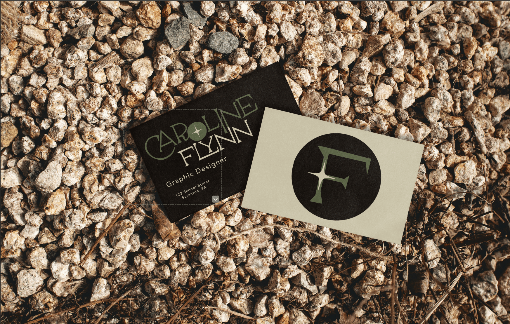
These are two mockups that I added my logo to: business cards and a paper bag. It's important to see how they look on different products and scenarios in the real world.
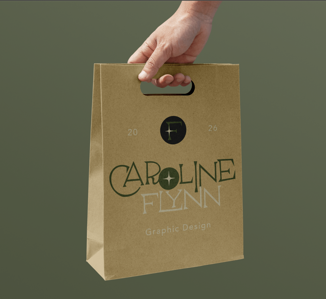
Animated Logo

I wanted to make a short animated version of my logotype to add some intrigue to my website and also to practice my motion graphics. I wanted the O to spin in, but I found that having the first part spin in with it made it look better, then I had my first name go down and look like it's pulling up my last name, which I thought made it feel more playful.