
Rosmarie Tissi Project
Social Media Campaign


The Brief
Create a short social media campaign, 5 posts and 5 stories, each being short animations. They should be based on an influential graphic designer and tell a narrative about their works or their life.
My Interpretation
My narrative was based on how Tissi would travel and disconnect from everything to just take in her surroundings and focus on her design. I picked 5 words that started with the letter of her last name to show how she impacted design.
Final Animation
The Brief
Create an animation to celebrate a famous graphic designer, highlighting how they changed the design landscape and impacted the world. We could use their designs or create new designs in their style.
My Interpretation
When Rosmarie Tissi traveled, she disconnected from friends, family, and her work for weeks on end. She not only went off the grid by leaving the country and having her alone time, but also she didnʼt follow the usual Swiss-style grids and formats in her works.



Rosmarie Tissi was a Swiss graphic designer from the 1960s who was known for not utilizing the usual grids. I found words that started with the letters of her last name to show the ways in which she changed the design world.
T is for Travel, she traveled to over 70 countries and was often disconnected from her life. I wanted to show her fast-paced nature with the triangles going off in different directions and her bold use of color.
I is for Innovation, she had her own unique style that strayed away from the strict grid of the Swiss style. I wanted to bring back some of those grids and structure while also playing around a little more.


S is for Swiss or international style, which Tissi found restricting. I was heavily inspired by a common Swiss-style layout, but I wanted to add her signature pop of color.
S is for Space, the ways in which she used negative space in her designs made the other parts more impactful. So I wanted to have the words dissipate into that space. I used the geometric R that she created as inspiration for the S.
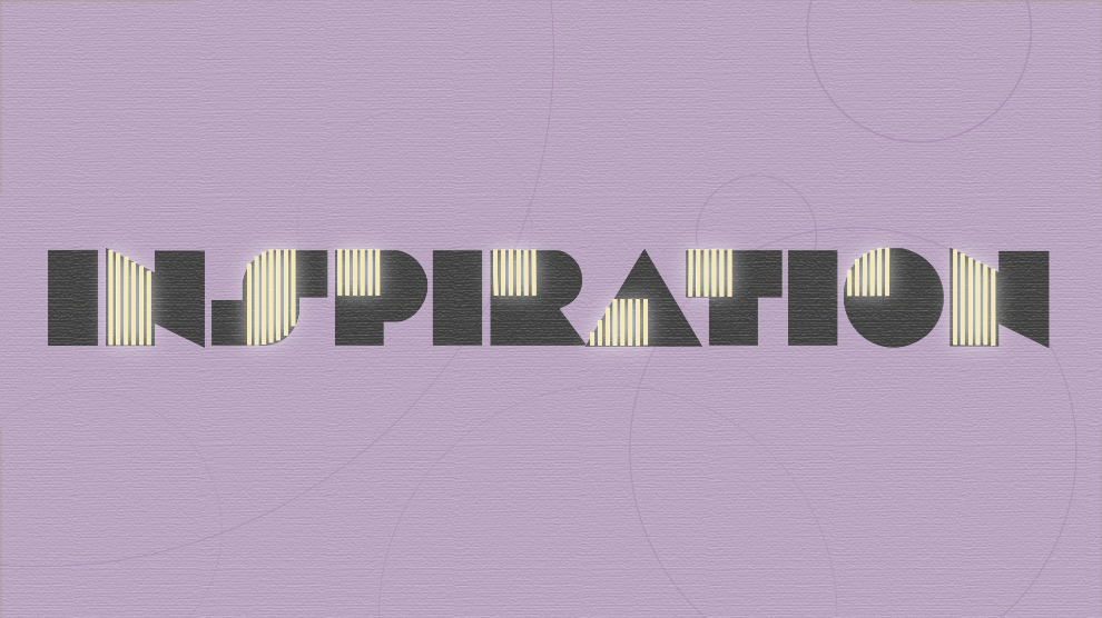
I is for Inspiration, she created this typeface in the 1970s, its named Sonora after the region in Mexico that she had recently traveled to.
Exhibition Space
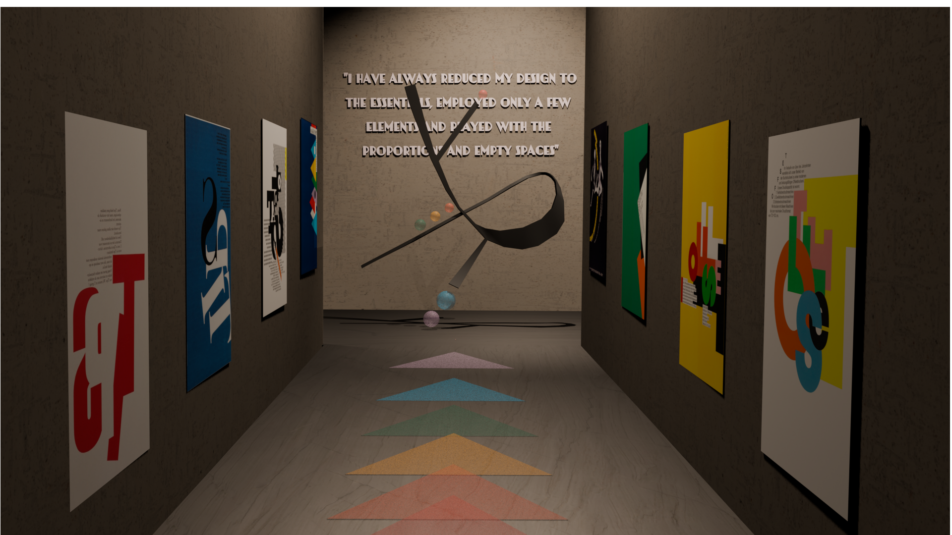
The Brief
Create a 3d exhibition space in Blender to display the designer's works or the works we created during the project.
My Interpretation
I made a T-shaped exhibition space, the main hallway shows off Tissi's most famous works, going in order from her oldest to her newest. The sculpture in the middle is a 3d model of a logo I made of her initials RT, also incorporating the same colors from the rest of my project. The quote on the back wall was one of my favorites from her; it explains the way she thinks of design.
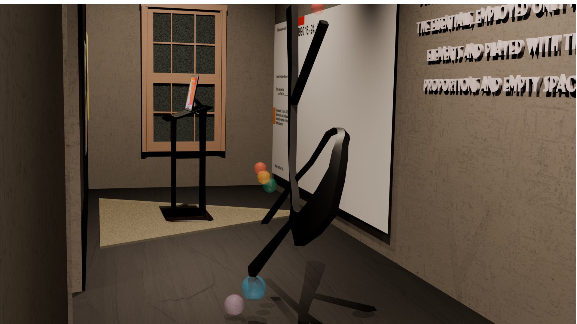
On the left side, I wanted it to be very interactive, so people can draw whatever they want on an Ipad then add it to Tissi's blank poster on the wall. I thought it would be a fun way for people to interact directly with her art.
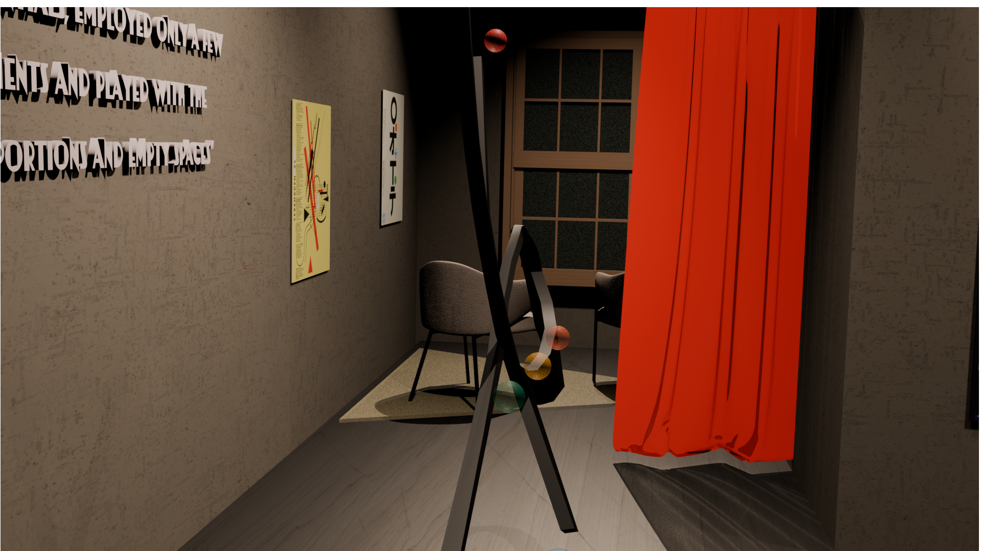
On the right side, I made a sitting area where people can just slow down, look out the window, and enjoy the scenery. Just like Tissi did when she travelled its important to take in the moment sometimes.